Suggestion Menus
Suggestion Menus appear when the user enters a trigger character, and text after the character is used to filter the menu items.
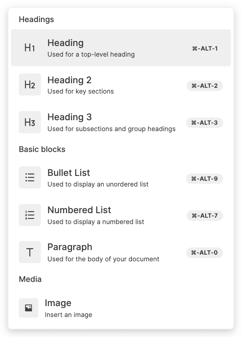
Slash Menu
The Slash Menu is a Suggestion Menu that opens with the / character (or when clicking the + button in the Block Side Menu.
Changing Slash Menu Items
You can change the items in the Slash Menu. The demo below adds an item that inserts a new block, with "Hello World" in bold.
Slash Menu items are objects with the following fields:
type DefaultSuggestionItem = {
  title: string;
  onItemClick: () => void;
  subtext?: string;
  badge?: string;
  aliases?: string[];
  group?: string;
};
title: The title of the item.
onItemClick: A callback function to call when selecting the item.
subtext: The subtitle of the item.
badge: Text to display in a badge within the item. Intended to show the keyboard shortcut for the item.
aliases: Other names for the item other than the title, which are used for filtering items based on the user query.
group: The group the item belongs to. Items in the same group are separated by a divider in the menu. To ensure items are grouped properly, make sure they are consecutive in the array of items you pass to the Slash Menu.
After creating your item, there are a some changes you must make to BlockNoteView to add it to the Slash Menu.
Passing slashMenu={false} to BlockNoteView tells BlockNote not to show the default Slash Menu. Adding the SuggestionMenuController with triggerCharacter={"/"} and a custom getItems function tells BlockNote to show one with custom items instead.
getItems should return the items that need to be shown in the Slash Menu, based on a query entered by the user (anything the user types after the triggerCharacter). In this case, we simply append the "Hello World" item to the default Slash Menu items, and use filterSuggestionItems to filter the full list of items based on the user query.
Replacing the Slash Menu Component
You can replace the React component used for the Slash Menu with your own, as you can see in the demo below.
Again, we add a SuggestionMenuController component with triggerCharacter={"/"} and set slashMenu={false} to replace the default Slash Menu.
Now, we also pass a component to its suggestionMenuComponent prop. The suggestionMenuComponent we pass is responsible for rendering the filtered items. The SuggestionMenuController controls its position and visibility (below the trigger character), and it also determines which items should be shown (using the optional getItems prop we've seen above).
Creating additional Suggestion Menus
You can add additional Suggestion Menus to the editor, which can use any trigger character. The demo below adds an example Suggestion Menu for mentions, which opens with the @ character.
Changing the items in the new Suggestion Menu, or the component used to render it, is done the same way as for the Slash Menu. For more information about how the mentions elements work, see Custom Inline Content.
Additional Features
BlockNote offers a few other features for working with Suggestion Menus which may fit your use case.
Opening Suggestion Menus Programmatically
While suggestion menus are generally meant to be opened when the user presses a trigger character, you may also want to open them from code. To do this, you can use the following editor method:
openSuggestionMenu(triggerCharacter: string): void;

// Usage
editor.openSuggestionMenu("/");
Waiting for a Query
You may want to hold off displaying a Suggestion Menu unless you're certain that the user actually wants to open the menu and not just enter the trigger character. In this case, you should use the minQueryLength prop for SuggestionMenuController, which takes a number.
The number indicates how many characters the user query needs to have before the menu is shown. When greater than 0, it also prevents the menu from displaying if the user enters a space immediately after the trigger character.